VMware vROps - "Monitor the Monitor" Dashboard

Of course a good dashboard is only half of the solution; you probably will not spend your waking hours sitting in front of it, watching, and making sure everything is cool. A comprehensive alerting and notification strategy should be part of any monitoring solution. The good news is that vROps comes with a set of self-monitoring alerts for which you should at least set up email notifications, and possibly consider integrating the alerts with your ITSM solution via the Rest API. These alerts will work even if part of the system has failed, for example: a service has stopped or a node failed even if HA has NOT been enabled provided that you have a multi-node solution. If you only have a single node and it fails then you obviously would not be alerted. However, I digress here, alerts and notifications are a topic for another post. Let's get back to our dashboard.
OK, so here's what the first attempt looks like. Let's go over the basic layout and functionality.
Dashboard Layout:
 Starting at the top of the first column (upper left corner of the content pane) is an Object List widget (1) configured to display vROps Analytics Cluster object with some additional metrics including health, number of nodes, as well as number objects and metrics collecting. The widget is set to Auto Select First Row, so the lone vROps Cluster object is always automatically selected without any user intervention. This option automatically loads the remaining widgets on the dashboard, giving it a somewhat autonomous feel.
Next, in the middle column is a Sparkline Chart widget (2) showing a lot more details than the object list. Besides health, object and metric counts, we also have Dynamic Threshold and Capacity Calculation metrics since it is important to keep an eye on them to ensure they are not taking too long to complete. If the calculations are taking to long, it may indicate that the cluster has not been sized correctly or there are database problems. The metrics in the sparkline chart are preset using an XML interaction file which will be covered in future posts. The third or last column has a Top Alerts widget (3) showing a vROps Cluster and descendant objects (vROps Nodes in this case) alerts. This way we can sweep from left to right and get a very clear picture of the vROps Cluster status.
vROps Cluster Object List Settings:
 Moving on, the second row of widgets pertains to vROps Nodes. Starting from the left is an Object List widget (4) listing all of the nodes in the above vROps Cluster. In this demo enviroment we only have 2 Data Nodes and 2 Remote Collectors, but in the real world you may have a lot more depending on the size of your virtual/cloud environment and the number of objects and metrics collected. (The widget was configured to only show Data Nodes because the Remote Collectors are not that exciting, in case you noticed that the # Nodes column in vROps Cluster object list was showing something else. At the cluster level, the node count will always include both data and remote collector nodes, but each has its own tag so we can select and show them separately in our widgets.) Again, just like with the cluster, we are using Auto Select First Row to automatically select the first available object and bring the dashboard to life by feeding the selected object name to our next widget.
Having passed the object name to our next widget, which in our case is the Sparkline Chart (5), we can display more detailed metrics than what the object list allows. In the sparklines, we can get into disk capacity and compute metrics in addition to object and metric counts per node. Obviously, selecting another node in step 4 would display the relevant metrics for that node in our sparklines. Here again we're using XML interaction file to define metrics.
Moving on, the Top Alerts widget (6) shows the selected node alerts. Again, this setup allows us to sweep from left to right in order to get a good indication of each node's status.
vROps Nodes Object List Settings:
 In the last or third row on the bottom of the dashboard is another Object List widget (7) configured to show us all relevant vROps services running on the selected node above. Since there are too many metrics to go through and pick for each service, I limited the columns to only collection statuses and health as they are the common metrics among all vROps services.
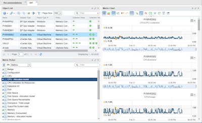
Keeping up with logic from the Cluster and Node object lists and limiting the metrics displayed, in the middle column is a Metric Picker widget (8) that enables the user to pick whatever metrics they want to see for the selected service. Lastly, the selected metrics in the metric picker will be added to our Sparkline Chart widget (9), enabling the user to view a lot of details for multiple services in a very limited space.
vROps Node Services Object LIst Setting:

Widget Interaction Settings:

Quick note here: remember form my Application VMs Dashboard post that the object relationships and widget interactions are the glue that allow for all the magic to happen. Here is the full widget interaction list you will need to configure in order to make this work.
In my opinion, this dashboard is only the beginning; other layouts, more metrics and widgets can be added to paint a more compelling picture. For example: my future iterations will probably also include the VM objects for each vROps node and their associated metrics. The sky's the limit so go and do likewise.
For more information about vROps, see the following resources:
vROps Extensibility Options:
You can extend vROps functionality by installing additional management packs:
VMware Management Packs include options for vRA, NSX, vRO, Log Insight, AWS, etc.
Blue Medora Management Packs include options for NetApp, Oracle, SAP, UCS, Citrix, etc.
Books:
VMware Performance and Capacity Management - Second Edition by Iwan 'e1' Rahabok
VMware vRealize Operations Managers Essentials by Matthew Steiner
Mastering vRealize Operations Manager by Scott Norris
VMware vRealize Operations Manager Capacity and Performance Management by Iwan 'e1' Rahabok
Official VMware:
VMware Professional Services
Official vROps Documentation
VMware Operations Management White Papers
vROps product page
Blogs:
VMignite by Lan Nguyen
vXpress by @Sunny_Dua
virtual red dot by @e1_ang
Virtualise Me by @auScottNorris
Elastic Sky Labs by @JAGaudreau
i'm all vIRTUAL by @LiorKamrat
Dashboard Layout:

Next, in the middle column is a Sparkline Chart widget (2) showing a lot more details than the object list. Besides health, object and metric counts, we also have Dynamic Threshold and Capacity Calculation metrics since it is important to keep an eye on them to ensure they are not taking too long to complete. If the calculations are taking to long, it may indicate that the cluster has not been sized correctly or there are database problems. The metrics in the sparkline chart are preset using an XML interaction file which will be covered in future posts. The third or last column has a Top Alerts widget (3) showing a vROps Cluster and descendant objects (vROps Nodes in this case) alerts. This way we can sweep from left to right and get a very clear picture of the vROps Cluster status.
vROps Cluster Object List Settings:

Having passed the object name to our next widget, which in our case is the Sparkline Chart (5), we can display more detailed metrics than what the object list allows. In the sparklines, we can get into disk capacity and compute metrics in addition to object and metric counts per node. Obviously, selecting another node in step 4 would display the relevant metrics for that node in our sparklines. Here again we're using XML interaction file to define metrics.
Moving on, the Top Alerts widget (6) shows the selected node alerts. Again, this setup allows us to sweep from left to right in order to get a good indication of each node's status.
vROps Nodes Object List Settings:

Keeping up with logic from the Cluster and Node object lists and limiting the metrics displayed, in the middle column is a Metric Picker widget (8) that enables the user to pick whatever metrics they want to see for the selected service. Lastly, the selected metrics in the metric picker will be added to our Sparkline Chart widget (9), enabling the user to view a lot of details for multiple services in a very limited space.
vROps Node Services Object LIst Setting:

Widget Interaction Settings:

Quick note here: remember form my Application VMs Dashboard post that the object relationships and widget interactions are the glue that allow for all the magic to happen. Here is the full widget interaction list you will need to configure in order to make this work.
In my opinion, this dashboard is only the beginning; other layouts, more metrics and widgets can be added to paint a more compelling picture. For example: my future iterations will probably also include the VM objects for each vROps node and their associated metrics. The sky's the limit so go and do likewise.
For more information about vROps, see the following resources:
vROps Extensibility Options:
You can extend vROps functionality by installing additional management packs:
VMware Management Packs include options for vRA, NSX, vRO, Log Insight, AWS, etc.
Blue Medora Management Packs include options for NetApp, Oracle, SAP, UCS, Citrix, etc.
Books:
VMware Performance and Capacity Management - Second Edition by Iwan 'e1' Rahabok
VMware vRealize Operations Managers Essentials by Matthew Steiner
Mastering vRealize Operations Manager by Scott Norris
VMware vRealize Operations Manager Capacity and Performance Management by Iwan 'e1' Rahabok
Official VMware:
VMware Professional Services
Official vROps Documentation
VMware Operations Management White Papers
vROps product page
Blogs:
VMignite by Lan Nguyen
vXpress by @Sunny_Dua
virtual red dot by @e1_ang
Virtualise Me by @auScottNorris
Elastic Sky Labs by @JAGaudreau
i'm all vIRTUAL by @LiorKamrat


Comments
Post a Comment