VMware vROps - Application VMs Performance Dashboard

As previously mentioned in my VMware vROps - vSphere Cluster Capacity and Performance Dashboard, I like to go beyond the single-dimensional dashboards and strive for the "holy-grail" of monitoring, the Unicorn "single-pane-of-glass" that everyone loves to talk about, but rarely gets to see in real world. Well, there are many factors that come into play when creating "single-pane-of-glass" dashboards, but we'll get into that in future posts. Enough babble for now, let's break down this Stairway to Heaven dashboard, as my good friend Max Drury calls it.


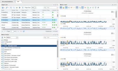
Let's go over the details and functionality of this dashboard. It starts off in the upper left corner with the Object List widget (1) that's the linchpin for the entire dashboard. Everything else depends on it and nothing works without it. I tailored the list of the VMs to a very specific Custom Group of SQL servers. This way the user does not have to look for the proverbial needle in the haystack of thousands of VMs. It provides a much smaller list that's a lot easier to work with. Other Custom Group can be created, for example: Exchange, SharePoint, etc. and filters set to only display those groups. Once the user finds and clicks on the VM of interest, all widgets on the dashboard will reload with relevant information. I also removed the default columns of questionable value in this case from the Object List and included some more useful columns with VM CPU related metrics. This will allow you to sort the list and quickly find the most impacted VMs.
From the top in the center column we have a Sparkline widget (2) to show the last six hours of mini charts with important metrics in four resource groups: CPU, memory, storage and network. In the right column we have Top Alerts widget (3) showing all alerts triggered on the selected VM.
Moving on down to the left, we have a Scoreboard widget (4) with compute KPIs. To the right in the center column, we have another Scoreboard widget (5) with more compute KPIs plus some important storage and network KPIs.Yes, some KPIs are repeated in sparklines and scoreboard, but they serve two different purposes. In sparklines you can see historical performance and adjust how far back you want to go using the Time Range. Whereas, in scoreboards you can set your own thresholds for yellow, orange, and red to call attention to breached KPIs. You can set these thresholds to the same level as Alert Symptoms or use different sensitivity based on your needs.
In the Right column, we have a Heatmap widget (6) showing all of the Guest OS File Systems with color-coded space usage. Hovering over the blocks in the heatmap brings up a pop-up identifying the partition and percent used.
Back to the left, is an Object List widget (7-9) showing the Host our selected VM is running on, host metrics in sparkline to the right and finally host alerts in the right-most column.
The last row of widgets (10-12) functions the same way as the host related ones above, but this time showing us Datastore metrics and alerts. And there you go, VM and relevant infrastructure information all in a single-pane-of-glass. How useful is that when you're troubleshooting? There is nothing like this in any version of vROps today unless you build it yourself. Good luck!

You probably noticed that I skipped over a top row of collapsed widgets. They include How to Use this Dashboard and Metric/KPI Guides. They are just simple Text widgets that have definitions of all the metrics used in the dashboard. This way you don't have to search for the definitions in the documentation. The idea for this came from one of my coworkers, Craig Risinger.
I will be posting an updated version of this dashboard in near future. It will be leveraging the new EPOps Agent metrics that will get us even closer to heaven with Guest OS and Application level metrics. And remember, possibilities are almost endless. If you had a storage management pack you could show relevant VM metrics down to individual spindle. Want network metrics? Just install the NSX management packs.
Lastly, this dashboard can be simply cloned, another Custom Group filter supplied and repurposed for a different application. This is very easy and within minutes you can provide a very advanced view for another application team with minimal changes.
As always thanks for reading and see the following resources for more vROps info:
Books:
VMware vRealize Operations Managers Essentials by Matthew Steiner
Mastering vRealize Operations Manager by Scott NorrisVMware vRealize Operations Manager Capacity and Performance Management by Iwan 'e1' Rahabok
Official VMware:
VMware Professional Services
Official vROps Documentation
VMware Operations Management White Papers
Extensibility and Management Packs
Blogs:
vXpress by @Sunny_Dua
virtual red dot by @e1_ang
Virtualise Me by @auScottNorris
Elastic Sky Labs by @JAGaudreau
i'm all vIRTUAL by @LiorKamrat


That's a great looking dashboard. Do you have this available for download or more instructions on how to build this from scratch?
ReplyDeleteI would really like to get this as well....thanks in advance.
DeleteIs this available for download?
ReplyDeleteWould it be possible to show the configuration of each widget? I can't seem to get my VM Host Object Widget to show the host of the selected VM. Would also like to see the custom XML behind the Scoreboards.....great Dashboard!!
ReplyDelete