VMware vROps - Datastore Oversubscription Dashboard
A customer recently challenged me to create a Datastore dashboard showing how oversubscribed their thin provisioned vSphere Datastores are. This was a twist on my VM Storage Consumption dashboard that I have been doing for a while and will post next time. The goal of this new dashboard is to visualize the Datastore subscription rate of the thin provisioned Datastores in the virtual environment. In addition, it can show impacted virtual machines as well as some additional storage-related key performance indicators.
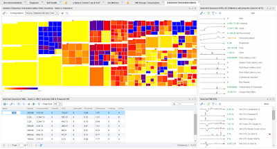
To help us visualize the Datastore subscription rate, we are using a Heatmap widget (1) configured to only show all datastores in the environment and to group them by vSphere Cluster they belong to. Each colored square represents an individual Datastores and its size relevant to other Datastores in Terabytes. The color of the square indicates the subscription rate. I'm using a super metric for the subscription ratio as this metric does not exist OOTB. (I'll cover super metrics in future posts.) If you look at the heatmap legend in the bottom of the widget you will notice the scale goes from 0 to 250. That is 250 percent, meaning that any Datastore in red is 100% or more subscribed. When you get to blue with your Datastores they turn blue and are 250% or more oversubscribed. Depending on your environment, this may or may not be acceptable. The good news is that with this Dashboard and some alerts you can keep an eye on your Datastore oversubscription rates.

Selecting a Datastore square in the heatmap will load the Object List widget (2) below with all VMs on that Datastore. The list shows some VM storage usage stats in additional columns such as VM disk size, provisioned space, snapshot size, IOPS, latency, and a few CPU related KPIs for good measure.
On the right side is the Sparkline widget (3) showing a full spread of Datastore KPIs for the selected Datastore. The included KPIs range from the number of VMs, through capacity to performance, ending with error related metrics. Keep in mind that some metrics are only relevant to SAN based storage such as FC, FCoE or iSCSI. If you selected a NFS based Datastore some metrics would show No Data because the metrics are not applicable to that type of storage medium. Also, don't forget that you can always use the Time Range icon to adjust how far back the sparklines charts go. Just remember that on these tiny sparklines, the longer the time range, the lower the resolution.
Lastly another Sparkline widget (4) showing the selected VM from the object list with KPIs in our traditional CPU, memory, disk and network food groups.
For more information about vROps, see the following resources:
Books:
VMware vRealize Operations Manager Capacity and Performance Management by Iwan 'e1' Rahabok
Official VMware:
VMware Professional Services
Official vROps Documentation
VMware Operations Management White Papers
Extensibility and Management Packs
vROps product page
Blogs:
vXpress by @Sunny_Dua
virtual red dot by @e1_ang
Virtualise Me by @auScottNorris
Elastic Sky Labs by @JAGaudreau
i'm all vIRTUAL by @LiorKamrat
To help us visualize the Datastore subscription rate, we are using a Heatmap widget (1) configured to only show all datastores in the environment and to group them by vSphere Cluster they belong to. Each colored square represents an individual Datastores and its size relevant to other Datastores in Terabytes. The color of the square indicates the subscription rate. I'm using a super metric for the subscription ratio as this metric does not exist OOTB. (I'll cover super metrics in future posts.) If you look at the heatmap legend in the bottom of the widget you will notice the scale goes from 0 to 250. That is 250 percent, meaning that any Datastore in red is 100% or more subscribed. When you get to blue with your Datastores they turn blue and are 250% or more oversubscribed. Depending on your environment, this may or may not be acceptable. The good news is that with this Dashboard and some alerts you can keep an eye on your Datastore oversubscription rates.

Selecting a Datastore square in the heatmap will load the Object List widget (2) below with all VMs on that Datastore. The list shows some VM storage usage stats in additional columns such as VM disk size, provisioned space, snapshot size, IOPS, latency, and a few CPU related KPIs for good measure.
On the right side is the Sparkline widget (3) showing a full spread of Datastore KPIs for the selected Datastore. The included KPIs range from the number of VMs, through capacity to performance, ending with error related metrics. Keep in mind that some metrics are only relevant to SAN based storage such as FC, FCoE or iSCSI. If you selected a NFS based Datastore some metrics would show No Data because the metrics are not applicable to that type of storage medium. Also, don't forget that you can always use the Time Range icon to adjust how far back the sparklines charts go. Just remember that on these tiny sparklines, the longer the time range, the lower the resolution.
Lastly another Sparkline widget (4) showing the selected VM from the object list with KPIs in our traditional CPU, memory, disk and network food groups.
For more information about vROps, see the following resources:
Books:
VMware vRealize Operations Managers Essentials by Matthew Steiner
Mastering vRealize Operations Manager by Scott NorrisVMware vRealize Operations Manager Capacity and Performance Management by Iwan 'e1' Rahabok
Official VMware:
VMware Professional Services
Official vROps Documentation
VMware Operations Management White Papers
Extensibility and Management Packs
vROps product page
Blogs:
vXpress by @Sunny_Dua
virtual red dot by @e1_ang
Virtualise Me by @auScottNorris
Elastic Sky Labs by @JAGaudreau
i'm all vIRTUAL by @LiorKamrat


How did you create the super metric for the subscription ratio? thanks
ReplyDelete