VMware vROps - vSphere Cluster Capacity and Performance Dashboard Part 1

One thing you will notice about this dashboard is that it crosses from capacity to performance. I strongly believe that you cannot manage one without considering the other, as they go hand-in-hand. This also addresses the one weakness of the out-of-the-box (OOTB) dashboards, in that they focus on a single resource and object type at a time. For example, CPU and Host. This single-dimensional focus is a limiting factor in presenting a comprehensive overview of available information. Painting a more complete story with the available data is one of the most important factors I try to focus on in dashboard design. I strive to achieve information nirvana in a single pane-of-glass to assuage all user needs in making a decision or finding the root-cause of a problem, or at least as close as possible.
Now, let's go over the dashboard and see what's cooking:

Below the Health Chart widget, we have a Properties widget (2) that's set to display selected cluster key properties, such as DRS automation level, HA, Admission Control, etc. The reason I include this info on this dashboard is that sometimes these settings get disabled during host maintenance. Then someone may forget to re-enable them, which then may lead to cluster imbalance during production times. So, instead for looking for this in vCenter you can just find it here and save some clicking.
Moving on, we have the Capacity Remaining widget (3), which gives us a basic cluster capacity overview.
At the top of the center column is a Scoreboard widget (4) with cluster capacity statistics, which go a step deeper. This section covers a lot of ground, from host and VM numbers through compute rations, capacity remaining based on averages, to reclaimable capacity (formerly known as waste).
Below that, the Storage and Network scoreboard (5) covers storage IOPS, latency and error statistics. Network usage and errors round off this section.
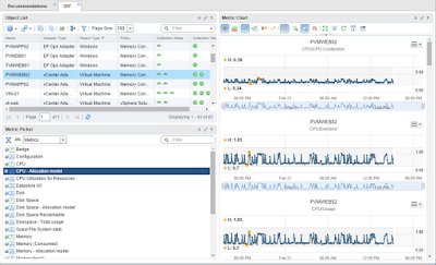
The right column scoreboard (6) provides all of the important compute KPIs starting with CPU Contention at cluster, host and VM levels, moving on to CPU Ready, Co-Stop, Swap Wait, and IO Wait. The second half of the scoreboard covers memory basics from contention, usage, availability, to ballooning, swapping, swap in and decompression rates.
All scoreboard widgets use a custom interaction file to dynamically display only metrics we're interested in based on the selected cluster. Without those interaction files, we would have to rely on random metrics that vROps will throw at us, or statically define them for a specific cluster. This would in effect negate the ability to select the cluster and get relevant data dynamically.
Also, the metics I chose for this example are only a sample of what one of my customers was interested in. You may have different preferences, so there is no right or wrong here.

The inspiration for this dashboard came from several sources. First, my good friend Max Drury, who I used to work with at two previous companies and still share lots of ideas with. Second, frustration that nothing like this is provided OOTB. When you look at at the OOTB capacity dashboards, they don't consider current performance. You don't want to be making capacity decisions without knowing how your environment performing first. I think some of Sunny Dua's cluster dashboards may have influenced my design as well.
If you try to recreate this dashboard, you will quickly notice that there is one tragic flaw. Mainly, looking at some of the metrics, such as Highest VM CPU Ready %, there is no way to tell which VM is behind the highest value reported. This is due to two factors. First, the scoreboard widget does not have a drill-down functionality. Second, all Highest ... metrics are derived using a super metric maximum function, and even though we can record the highest value for a specified metric, there is no way to record the object that the value was generated by. Fortunately, I came up with a simple solution to this little inconvenience with a set of Top Offender dashboards for VMs, Hosts, and Datastores. These three dashboards also leverage a new vROps feature called Dashboard Navigation that enables interactions among dashboards similar to widgets. So, after selecting your cluster, you can jump into a list of VMs that are behind some of the Highest metric values. I will cover this in Part 2 of this post.
For more information about vROps, see the following resources:
Books:
VMware vRealize Operations Managers Essentials by Matthew Steiner
Mastering vRealize Operations Manager by Scott NorrisVMware vRealize Operations Manager Capacity and Performance Management by Iwan 'e1' Rahabok
Official VMware:
VMware Professional Services
Official vROps Documentation
VMware Operations Management White Papers
Extensibility and Management Packs
Blogs:
vXpress by @Sunny_Dua
virtual red dot by @e1_ang
Virtualise Me by @auScottNorris
Elastic Sky Labs by @JAGaudreau
i'm all vIRTUAL by @LiorKamrat


Peter,
ReplyDeleteGreat dashboards. Is there a way you can share the metrics and xml formulas used to generate these dashboards. A step by step would really be appreciated.
Ditto on the last comment. Knowing what metrics to target is half the battle.
ReplyDelete